matplotlibに関する技術情報を紹介する
 matplotlib
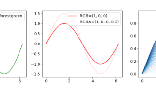
 【python】matplotlibでグラフに色を指定する方法【カラーマップ】
matplotlibで作成したグラフに色を設定する方法を紹介します。
matplotlibでのグラフの作成方法に...
 matplotlib
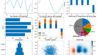
 【Python】matplotlibでグラフを作成する方法まとめ
Pythonのグラフ作成における定番ライブラリmatplotlibを用いて、棒グラフやヒストグラム、散布図などよく使う...
 matplotlib
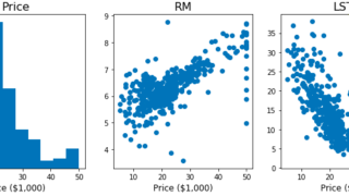
 matplotlibで複数のグラフを並べて表示する方法 plt.subplots
画像データとテーブルデータを対象にmatplotlibを用い複数のグラフを並べて表示する方法を紹介します。
学べる...
 matplotlib
 pythonで時系列データに移動平均線を追加してみた
こちらの記事で、時系列データを簡単に可視化する方法を紹介しました。
なので今回は金融チャートに必ず用...
 matplotlib
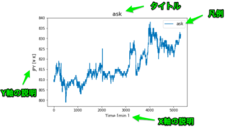
 pythonで時系列データを可視化する方法を解説してみた
時系列データを簡単に可視化し、グラフ表示する方法を紹介していきます。
可視化にあたってはpythonの可視化用ライブラ...